FINTECH WEBSITE DESIGN
Belema Fintech Website
I redesigned Belema Fintech’s website to give the business a more polished online presence and present its products and services clearly. The design brings together structured content, bold typography and the brand’s green palette to help visitors explore what the company offers.
Visit live project ↗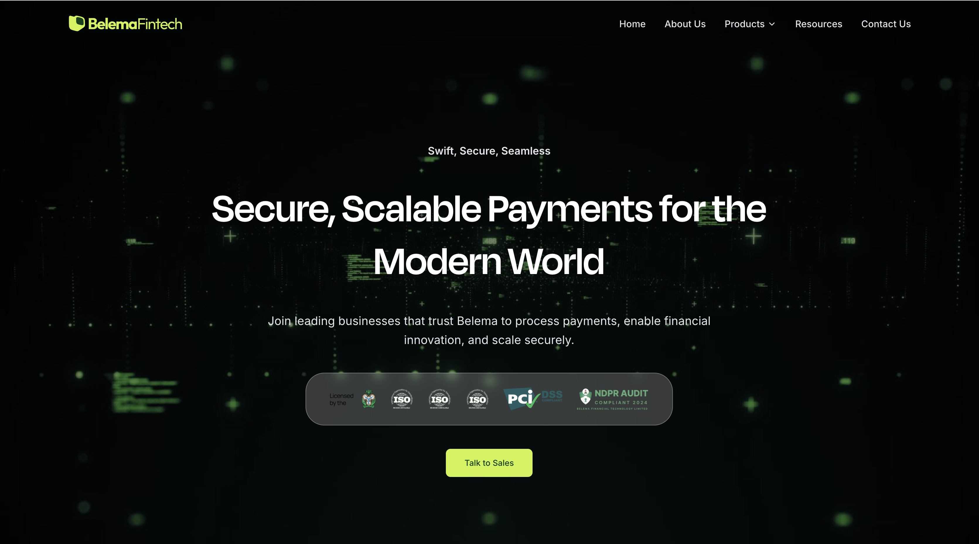
- My role
- Website Designer — responsible for the visual design and interface layouts.
The brief
Belema Fintech wanted its existing website to look better and feel more presentable, while showing the full range of its services and products.
My responsibility was the website’s design. The focus was on improving the visual presentation and organising information so visitors could understand the business and explore its offerings.
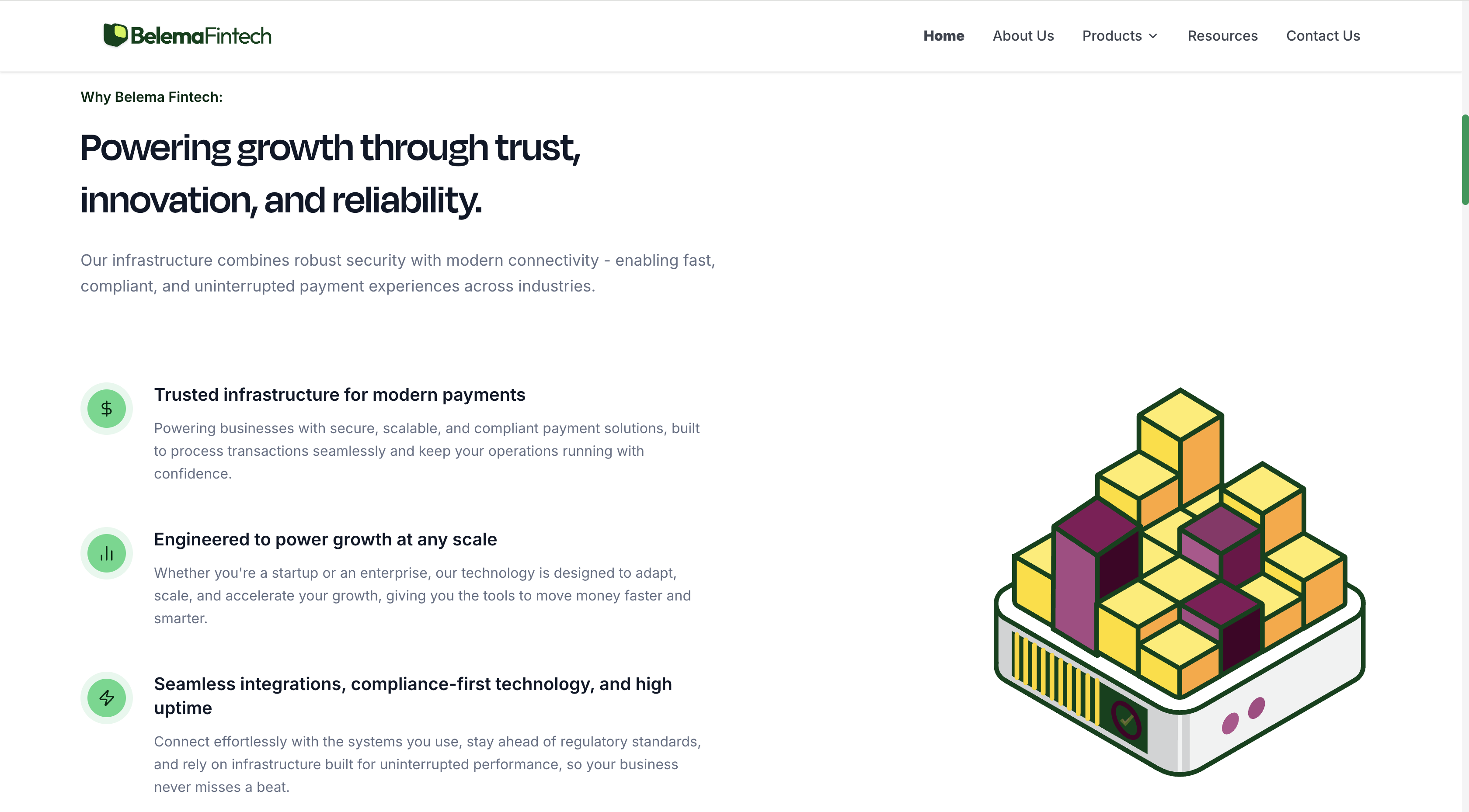
Giving the content a clear hierarchy
The design uses large headings to establish the main message, followed by supporting copy and smaller groups of information. In the services section, icons and short headings separate the company’s key benefits into distinct points.
Light backgrounds give the content room to breathe, while green accents and a colourful illustration connect the section to the brand. This creates a clear visual order for visitors scanning the page.
Introducing the business
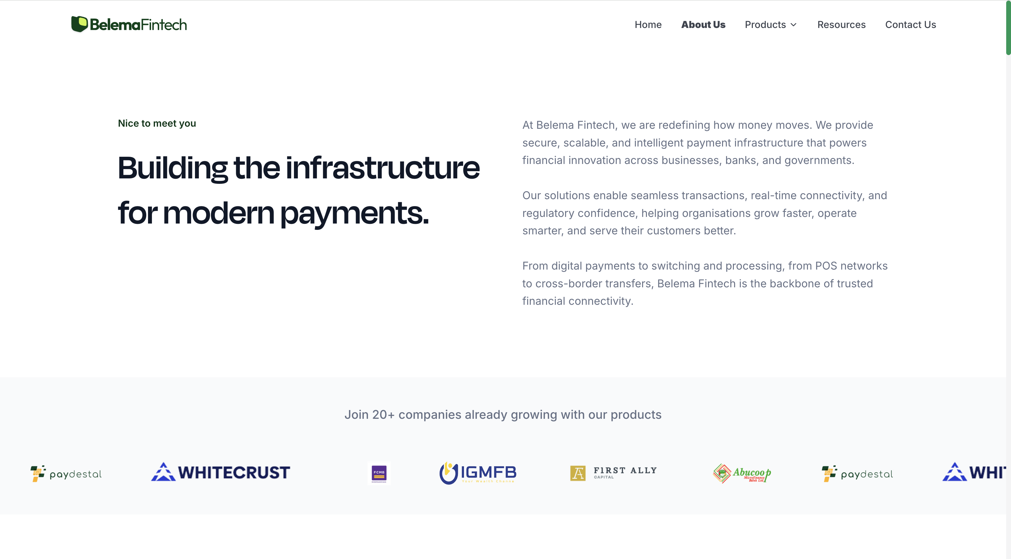
The About page pairs a clear statement of what Belema does with a more detailed company introduction. The two-column layout separates the headline from the explanation, keeping each easy to scan.
A company-logo strip sits below the introduction, adding visual context to the business presentation without competing with the main message.
Making products and contact details easy to find
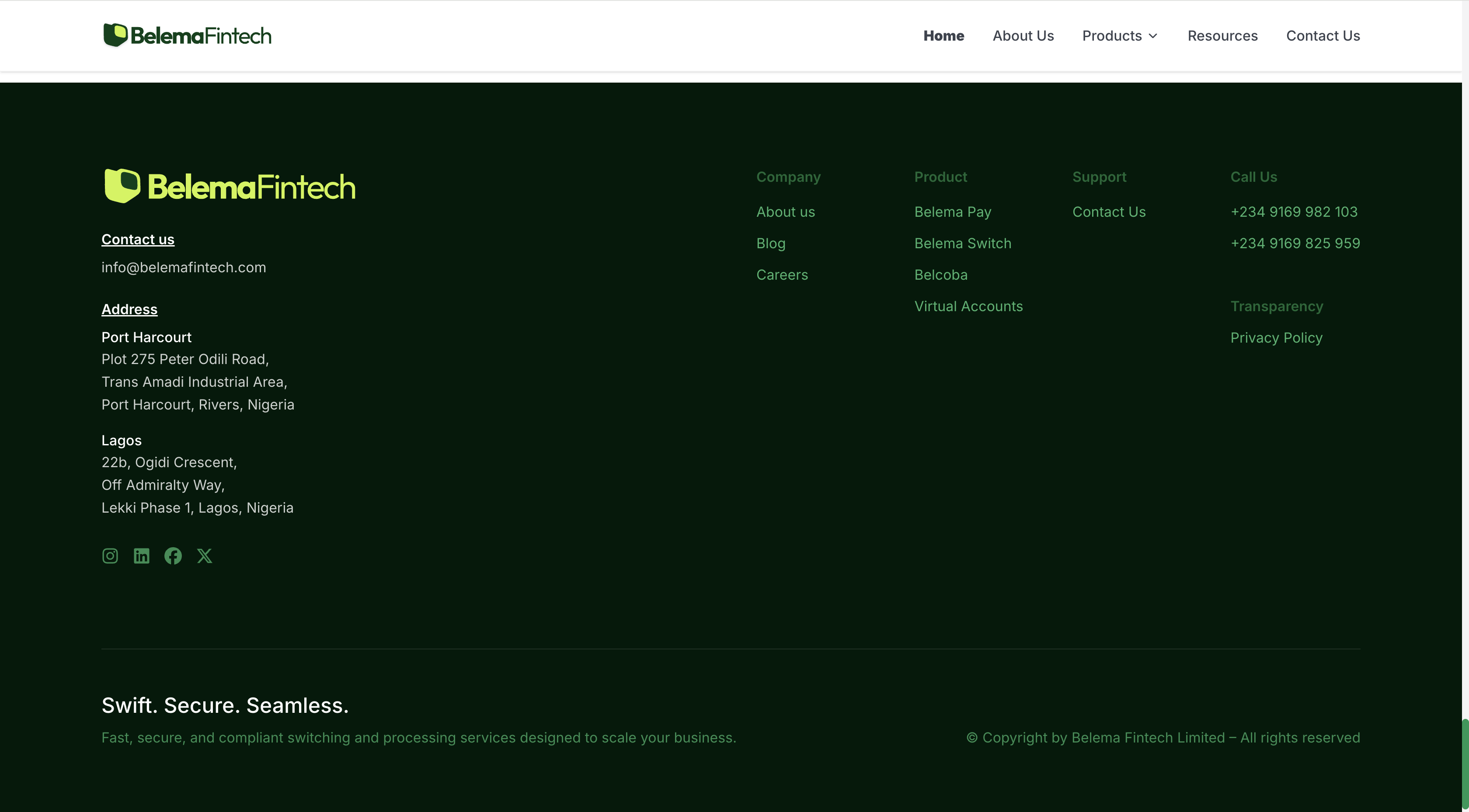
The main navigation groups the website into familiar destinations: Home, About Us, Products, Resources and Contact Us.
The footer provides another route to the product pages and brings together company information, support links, contact details and office locations. Its dark green background and lime brand mark create a distinct ending to the page.
The outcome
The redesigned website gave Belema Fintech a more polished presentation of its products, services and company information.
I also observed higher search rankings after launch. This is a qualitative observation; the case study does not attribute that improvement to visual design alone.