MOBILE APP · UI/UX DESIGN
Food Couriers
Food Couriers is a client food-delivery app project I designed in Figma. The work explores the journey from browsing meals to reviewing an order, supported by research involving 20 participants. I delivered the completed interface designs to the client.
Visit live project ↗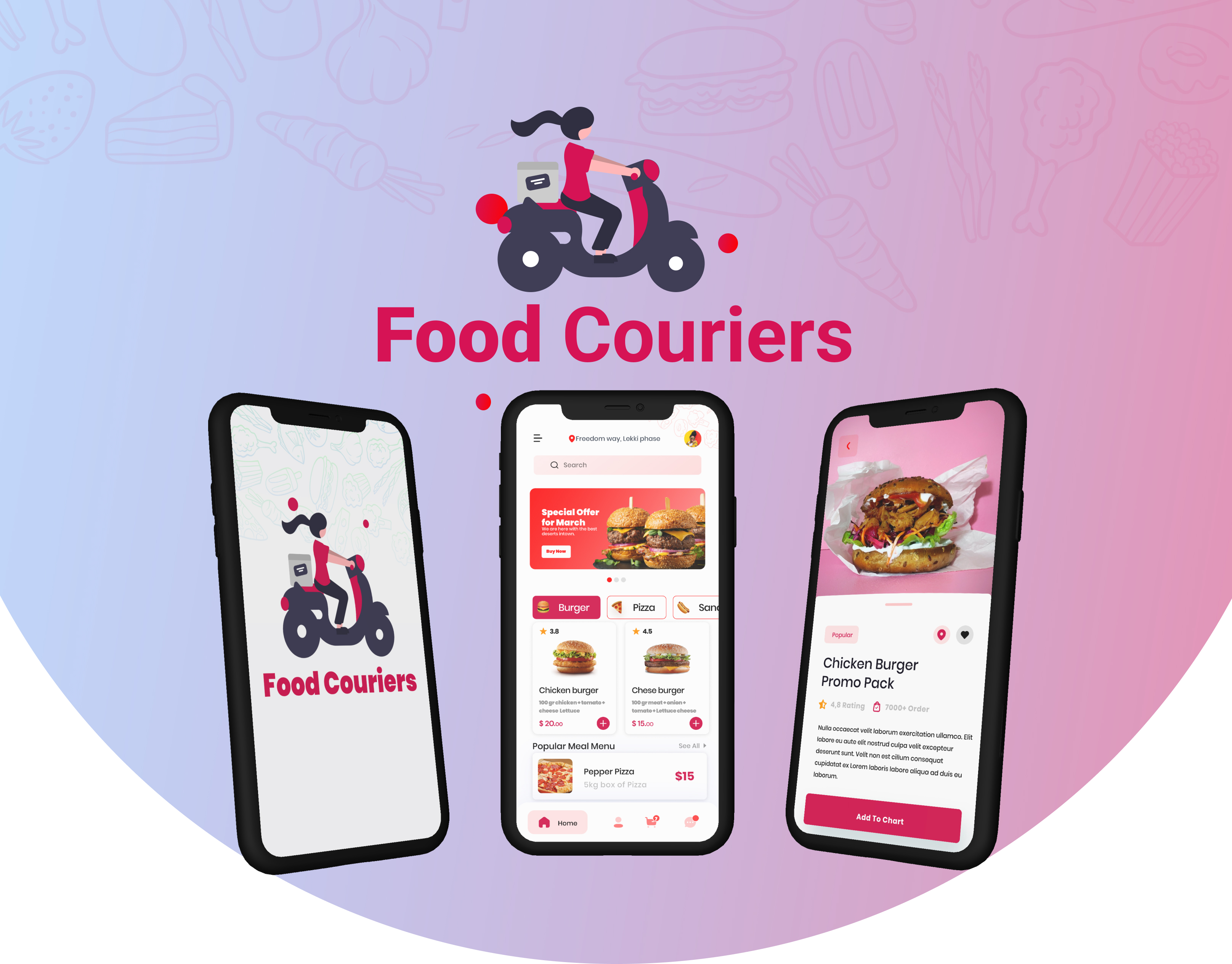
- My role
- UI/UX Designer
- Tools
- Figma
The brief
The project centred on a mobile food-delivery experience. The design needed to bring food discovery, meal information and order review into a connected journey.
My responsibility was the app's UI/UX design. I developed the interface screens and their visual presentation for delivery to the client.
Research and the core journeys
The research phase involved 20 participants. The project presentation also documented task flows for getting started with the app and placing a food order.
These flows frame the experience around two practical tasks: reaching the home screen and moving from selecting a meal to reviewing an order. The final screens show how those tasks connect across the app.
From browsing to choosing a meal
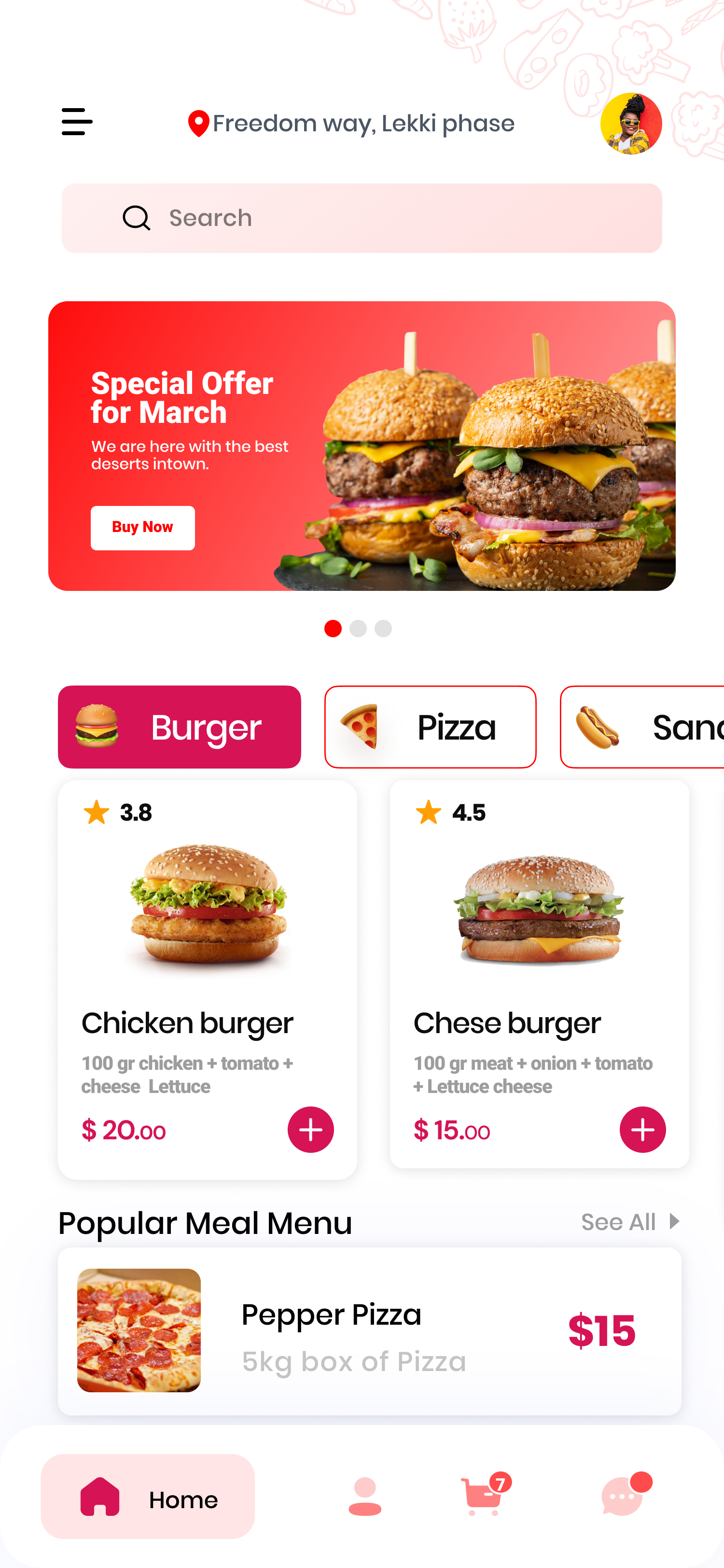
The home screen brings together the delivery location, search, food categories, promotional offers and meal cards. Images, prices and ratings give people information to compare while browsing.
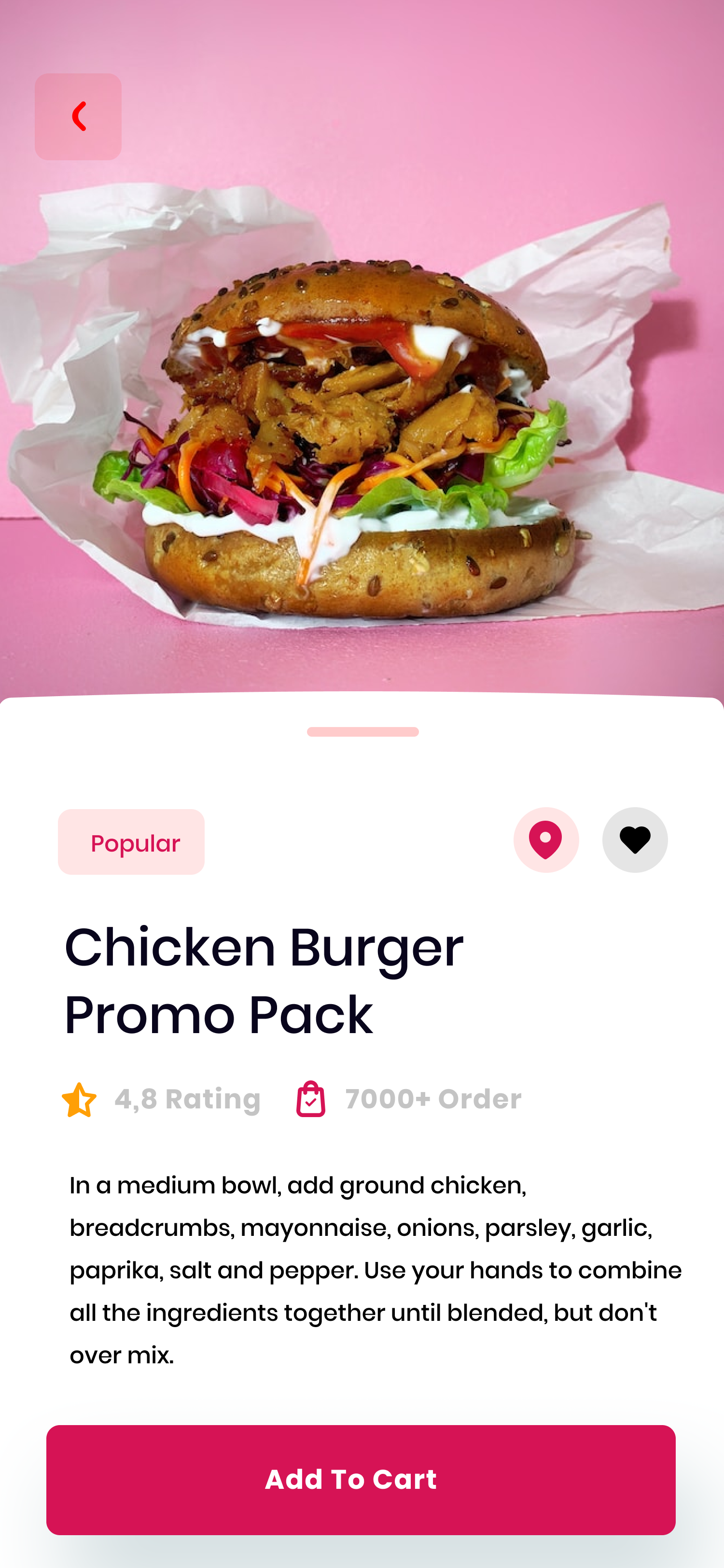
The food-detail screen gives the selected meal more space, pairing a large image with its name, supporting information and a prominent action at the bottom. This creates a visual transition from exploring several options to considering one item.
Reviewing the order and managing a profile
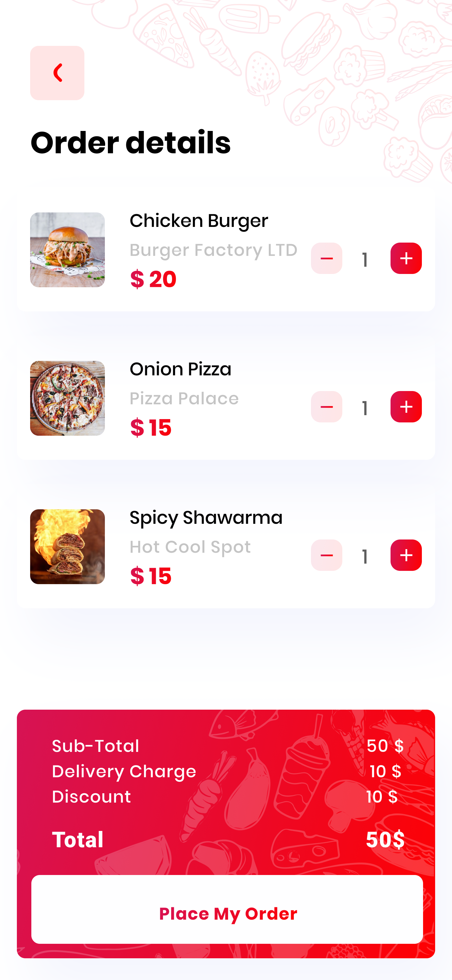
The order screen groups selected meals into separate rows with quantity controls. A summary area beneath the items brings the price breakdown and order action together.
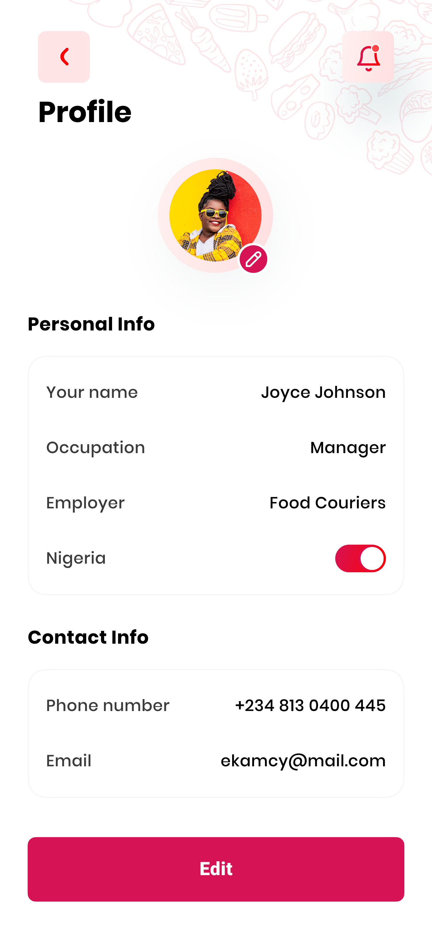
The profile screen separates personal information from contact details and provides an edit action. Both screens use grouped information and clear headings to make their content easier to scan.
A consistent visual language
The interface combines pink and red accents with light backgrounds, rounded cards and food photography. Poppins typography provides a consistent style across headings, labels and supporting text.
Food illustrations and decorative line drawings give the app a recognisable character. Stronger accent colours draw attention to primary actions and selected navigation elements.
Delivery and reflection
I delivered the completed interface designs to the client, covering the welcome experience, meal discovery, food details, order review and profile management.
Looking back, my next iteration would focus on interface-copy consistency, accurate price calculations and task-based usability testing of the ordering flow. These checks would help refine the design before implementation.