PRODUCT DESIGN & DEVELOPMENT
Kuppid — Designed for real connection
I designed and developed Kuppid, a dating platform for adults across Nigeria. Over two months, I worked across its brand, public website, member experience and admin tools—connecting the first visit to profile creation, discovery, mutual matching and conversation.
Visit live project ↗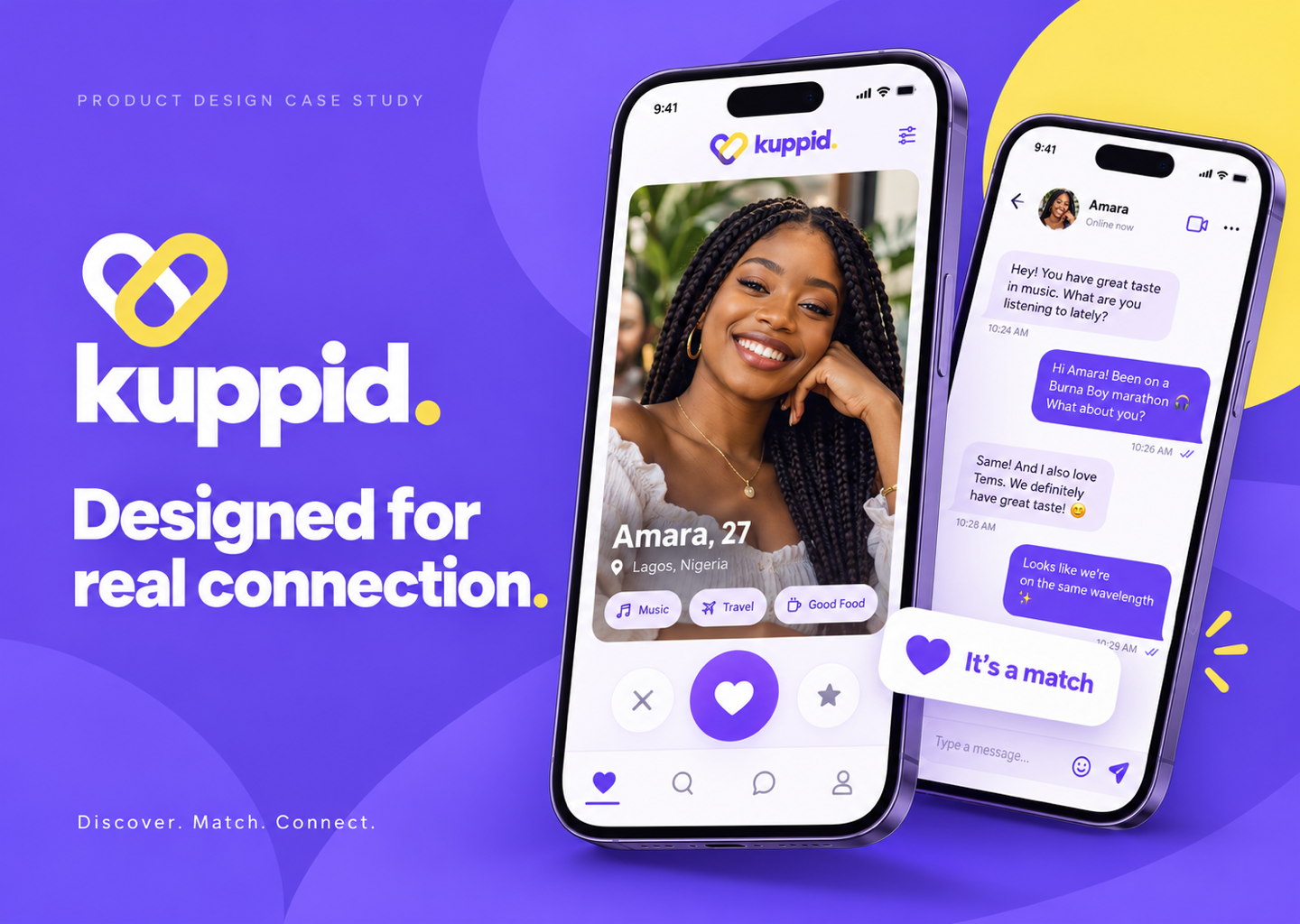
- My role
- Designer & Developer
- Timeline
- 2 months
- Tools
- HTML, CSS, JavaScript, Supabase, Firebase Hosting, Paystack, Brevo
The project at a glance
Kuppid brings the public website and the signed-in dating experience together. The public site introduces the product; the app lets members create a profile, discover people, express interest and talk after a mutual match. Behind the scenes, an admin dashboard supports member management, reports, payments and email communication.
My role covered both design and development. That meant taking responsibility for how the experience looked, how the different journeys connected and how the product behaved when something went wrong. The project took two months.
The challenge: make connection feel approachable
A dating platform asks people to share personal information before they know whether the experience will be worthwhile. The design therefore needed to answer practical questions early: What am I joining? How do matching and messaging work? What stays private? What can I do if I feel uncomfortable?
I treated clarity as a product requirement. The goal was a connected journey with understandable actions, visible feedback and accessible routes to support, rather than a collection of attractive screens.
A visual identity with warmth and confidence
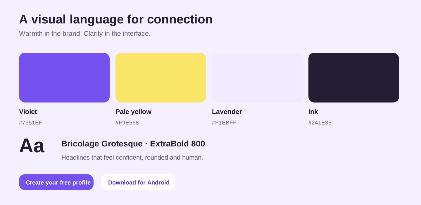
The interlocking heart-link mark expresses connection without relying on a generic heart alone. Violet anchors the interface, pale yellow adds warmth, and lavender surfaces keep the experience light. Dark text maintains hierarchy across cards and forms.
Bricolage Grotesque ExtraBold gives the brand and major headings a distinctive voice. Rounded controls and profile cards carry that warmth into the product, while familiar labels and consistent spacing keep actions readable.
The landing page: start with a clear invitation
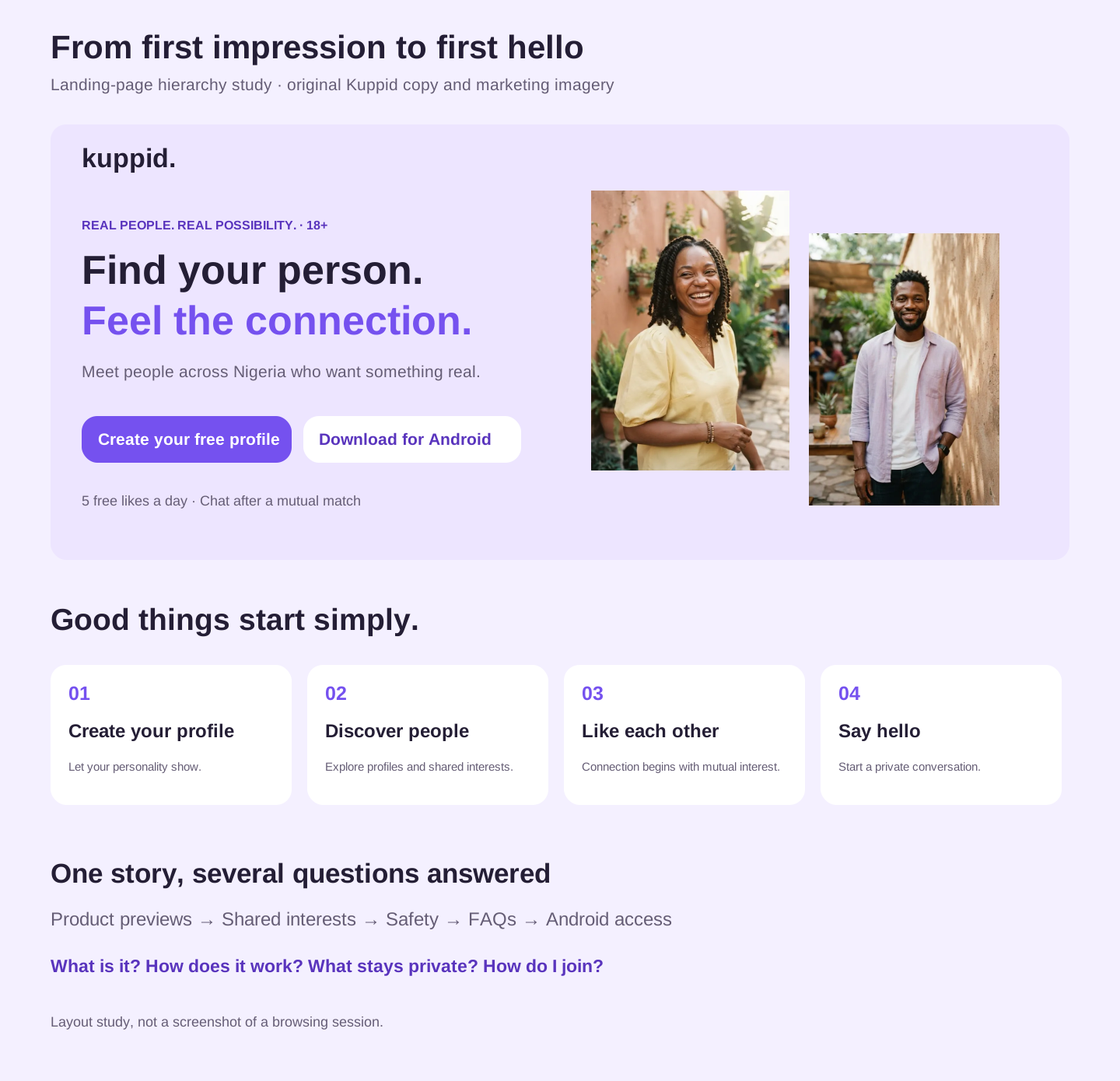
The hero leads with “Find your person. Feel the connection.” The message is broad enough for a product open across Nigeria rather than tying the service to one city. Supporting copy explains the purpose before asking visitors to act.
The hero has two actions: create a free profile and download for Android. Login remains in the main navigation. The free allowance sits close to the signup decision, with no card required to start. This creates a clear hierarchy without asking visitors to choose among several competing hero buttons.
Explain the journey before asking for commitment
“Good things start simply” breaks the experience into a short sequence: create a profile, discover people, establish mutual interest and start a conversation. This gives visitors a mental model before they enter the app.
The “A look inside” section then illustrates discovery, shared reasons and messaging. Demo profiles are explicitly labelled fictional. The previews show what the product does without presenting invented member stories as social proof. Animated details inside the preview cards add life while the cards themselves stay in place. Reduced-motion preferences are respected.
Shared interests give people a reason to say hello
The discovery and shared-interest sections move beyond the idea of simply browsing photos. They introduce interests and dating intentions as useful context for deciding whether to connect.
Inside the app, discovery filters and “Show me” preferences help shape the people a member sees. “Why you match” provides shared reasons: a free preview is available, while Premium reveals the fuller explanation. The case-study cover uses illustrative mockups; it should not be read as an exact capture of every production screen.
Safety belongs in the main story
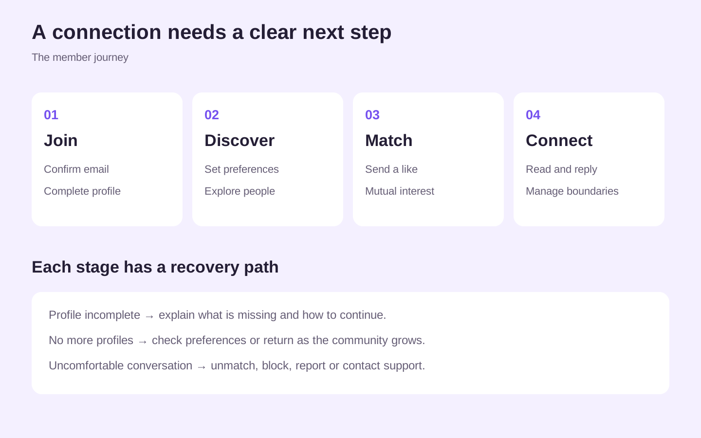
The landing page makes space for boundaries and personal comfort. Its message that people do not owe anyone a conversation supports the product’s unmatch, block and report actions. These routes matter as much as the invitation to connect.
The product distinguishes email verification from photo verification; photo review remains a future update rather than a claim the current experience can make. Profile privacy controls, hidden-area options and support access make privacy and recovery part of the normal journey.
FAQs, pricing and Android access remove uncertainty
FAQs answer the questions that can prevent someone from starting: whether an app download is required, who the service is for, where it is available, who can see a profile and how to stop a conversation. Local coverage is explained without inventing community counts or guaranteeing a match nearby.
The pricing page separates the free plan from paid benefits. Free members receive five likes per day and no daily picks. Premium adds unlimited likes, daily picks and plan-specific extras. Payments are one-time purchases without automatic renewal; a new plan can be queued after an existing subscription ends.
The Android section provides a direct download and installation steps, while browser access remains available. The public website and app are separate destinations, connected through signup, login and download actions.
From a saved profile to a useful discovery experience
Profile creation collects the information needed for discovery, including dating intention, interests and preferences. Completion and photo requirements are enforced by the backend, with instructions in the interface when information is missing.
Empty states matter here. Reaching the end of a list should not look like the app has failed. The interface gives members a way to review preferences, refresh discovery or come back as the community grows. Visibility controls let people pause discovery when they need a break.
Messaging: show what changed without making people search
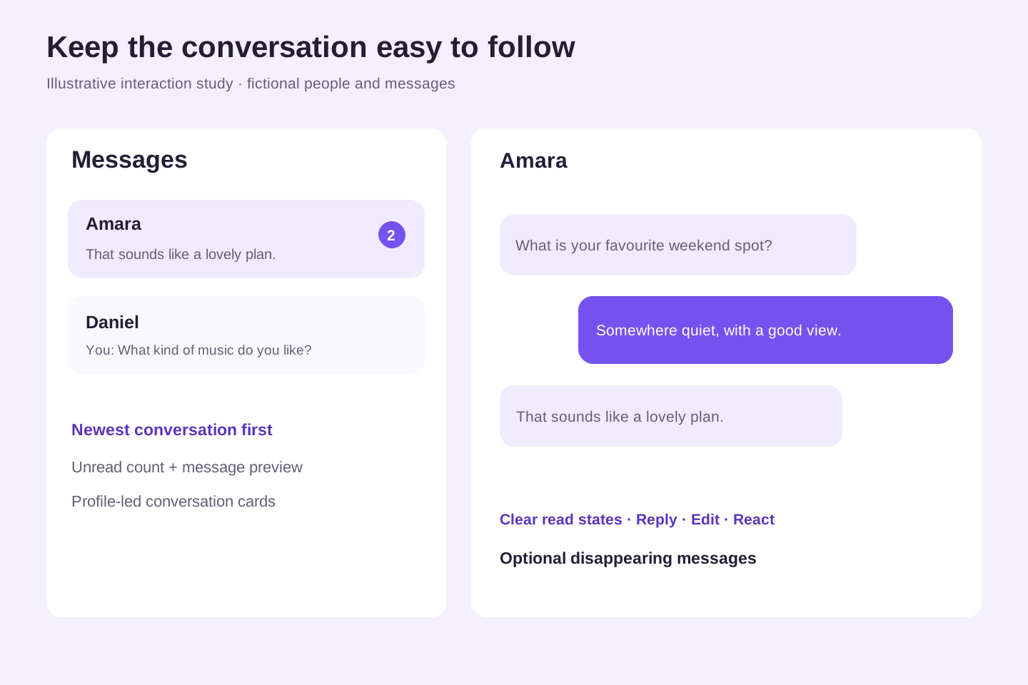
An important iteration addressed incoming messages that did not become obvious until a member opened the conversation. The inbox now exposes unread counts and previews, and puts the conversation with the newest message first. Profile-led cards preserve the visual style while making activity easier to scan.
Conversation tools include replies, edits, reactions and optional disappearing messages. Read-state consistency and attachment failure handling were part of the implementation work. The purpose is simple: members should understand what arrived, what was read and what action is available next.
Designing the tools needed to run the product
The admin dashboard brings together members, support, community activity, Premium and referral management. Operational views use counts where conversation contents are unnecessary, and permissions control which team members can access each area.
Support replies can be composed by email inside the dashboard rather than opening a separate mailbox. Email delivery reporting distinguishes provider acceptance from confirmed delivery. Welcome emails and birthday messages extend the product experience beyond the app, with wording and delivery handled as part of the broader service.
The work also included investigating profile-photo upload failures and improving feedback around errors. These operational details are part of the experience: a member’s journey continues when they need help.
Development: turn design decisions into enforceable behavior
The interface uses HTML, CSS and JavaScript. Supabase supports authentication, database access, storage and server-side functions, while Firebase Hosting serves the website and app. Paystack handles payments and Brevo supports app email delivery.
Important product rules belong on the server. For example, free-like allowances and Premium-only daily picks are enforced in the database rather than relying on a disabled button. Member-facing controls are paired with backend authorization and privacy checks.
Testing covered areas such as messaging, support replies, account changes, upload behavior and Premium access. A regression run during the documented work passed 108 tests, alongside targeted database checks. That is implementation evidence, not a claim that the product is bug-free or that conversion improved.
Iteration: clarity is a design decision
Several refinements came from specific feedback and observed issues. The original hero was restored above the product previews when a content change disrupted the page hierarchy. A duplicate city-guide link was removed from the hero, and the hero actions were reduced to signup and Android download, with login in navigation.
Messaging retained profile cards while gaining unread counts, previews and newest-first ordering. Discovery-filter alignment and form feedback were also reviewed. These changes show how presentation and functionality need to be evaluated together: adding a useful feature should not obscure an existing journey.
The outcome and what comes next
The delivered product connects a branded public website with a working member app and the tools needed to operate it. The work spans acquisition, account setup, discovery, matching, messaging, payments and support.
No conversion lift, retention improvement or formal usability-study result is claimed here. The case study focuses on the product delivered, the reasoning behind its design and the implementation issues addressed. Future evaluation should examine profile-completion drop-off, first-match and first-conversation journeys, mobile usability and support resolution.
My main takeaway was that a dating experience depends on clear expectations as much as visual appeal. The invitation, the first action, the feedback after that action and the route to help all need to feel connected.