NONPROFIT WEBSITE · DESIGN & DEVELOPMENT
Ochaworth — Purpose, made visible
I designed and developed the website for Ochaworth Leadership and Community Development Initiative over four months. The project brings the organisation’s advocacy, programmes and community activities together, with clear routes to learn more, volunteer, apply for membership and stay in touch.
Visit live project ↗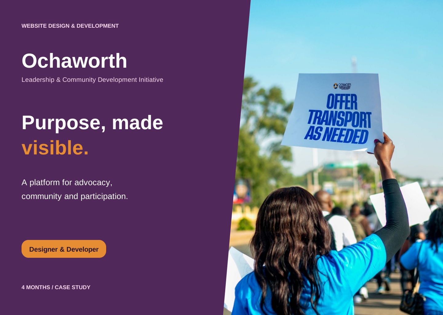
- My role
- Designer & Developer
- Timeline
- 4 months
- Tools
- React, TypeScript, React Router, Tailwind CSS, Vite, Netlify Forms, Netlify Functions
The project at a glance
Ochaworth Leadership and Community Development Initiative presents itself as a youth-led organisation advancing women’s and girls’ rights, health, equality and human dignity in Nigeria. Its website needs to introduce that work and help people understand how they can participate.
I designed and developed the site over four months. The scope includes the homepage, organisational information, programmes, gallery, blog, contact, volunteer and membership journeys, supported by a shared visual system and reusable React components.
The challenge: connect a broad mission to clear actions
The organisation’s work spans several themes, from women’s leadership and menstrual dignity to cancer awareness and support for vulnerable communities. A visitor needs a way to understand those themes without reading every page before finding a relevant action.
I approached the website as a sequence: introduce the mission, show the work, provide context, then offer a route to participate. Programme information, campaign photography and repeated calls to action connect the organisation’s message with practical next steps.
A visual language with warmth and presence
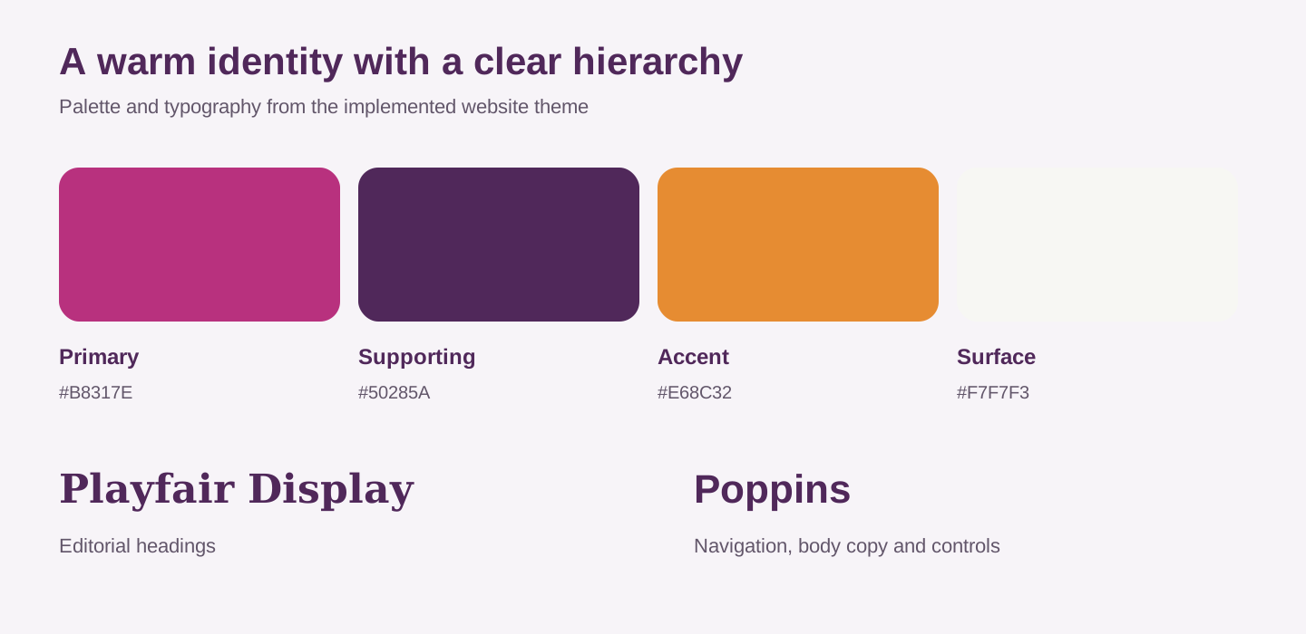
The implemented theme combines magenta, plum and orange with light content surfaces. Darker sections create emphasis, while the orange accent distinguishes important actions and highlighted words. Photography supplies the human context behind the organisation’s message.
Playfair Display gives major headings an editorial character; Poppins carries navigation, body copy and controls. Rounded cards, generous section spacing and consistent button styles connect pages that contain different kinds of information.
The homepage: lead with purpose, then open a path
The hero combines campaign imagery, a short mission-led headline and supporting text. Donate and Learn More offer two different levels of commitment: act on an existing interest or first understand the organisation. A rotating presentation introduces different campaign themes within the same opening structure.
The following participation cards introduce volunteering and community involvement. Rather than making the visitor search through the footer for every action, the homepage places opportunities to engage near the organisation’s main story.
The cover for this case study uses photography already published on the website. It is a portfolio presentation of the project, rather than a browser capture.
Explain the organisation before asking for deeper involvement
The About content pairs a collage of community images with a concise introduction and supporting themes. A dedicated About page expands this into mission, vision and values. This separates the quick overview needed on the homepage from the fuller context available to interested visitors.
The website also includes organisational statements and impact figures. Those are content supplied by the site; I have not treated them as independently verified findings or as performance outcomes of my design work.
Programme discovery: turn themes into understandable projects
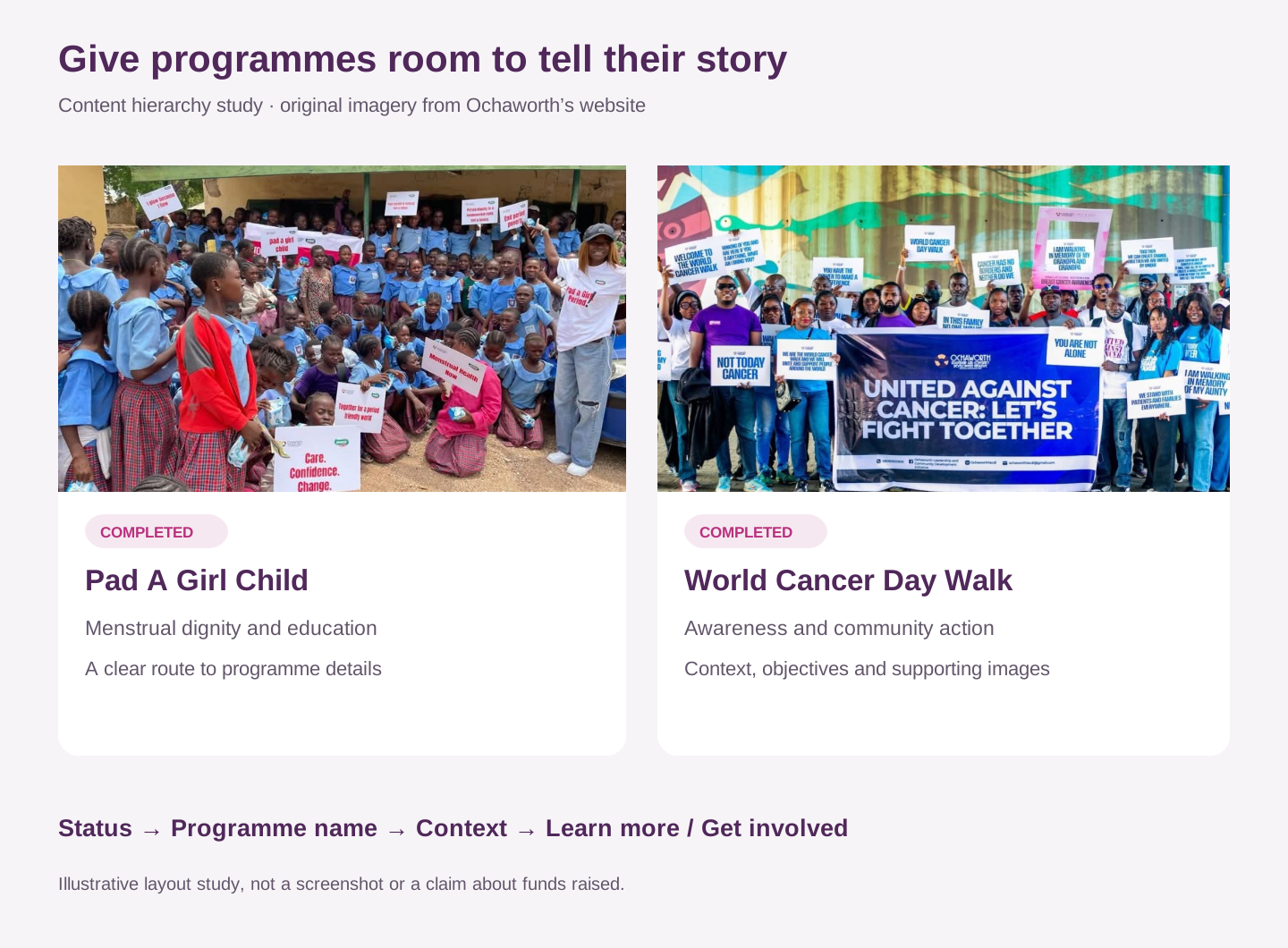
Programme cards pair imagery with a name, location or supporting context and a route to learn more. The dedicated programmes page distinguishes ongoing, upcoming and completed work, so visitors can understand whether an initiative is active or documented as past activity.
Programme details make space for descriptions, objectives, context, imagery and other supporting information. The structure can accommodate different initiatives without forcing every programme into a single long homepage description.
Showing the work through original campaign imagery
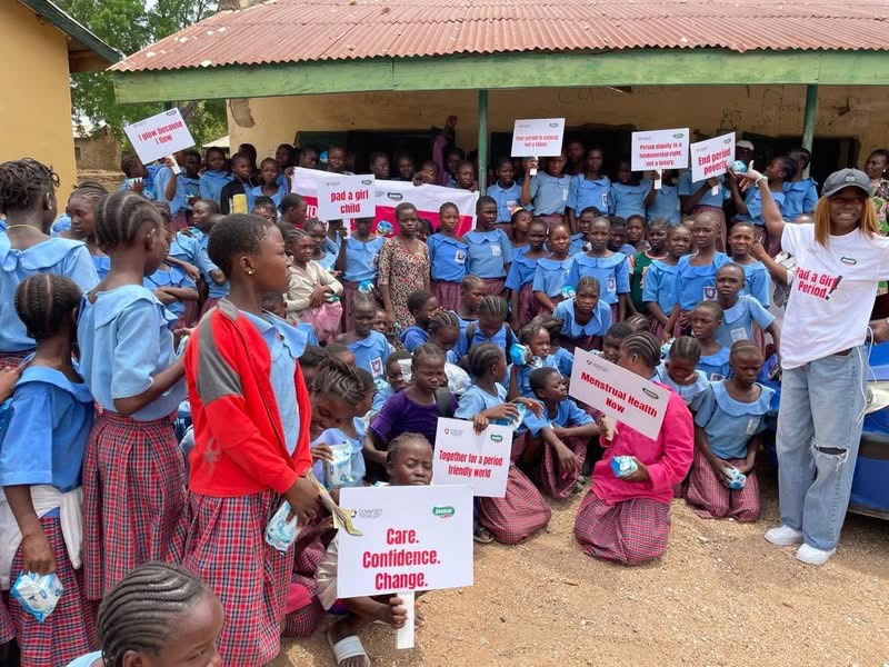
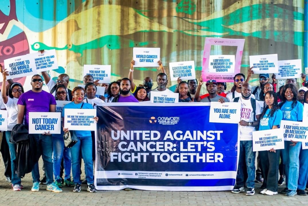
The site’s programme and gallery images put people and activities alongside the written mission. The published Pad A Girl Child content concerns menstrual-health education and dignity; the World Cancer Day Walk content introduces awareness and community action.
These examples explain the kind of information the website brings together. The case study uses the organisation’s existing imagery as project material without presenting campaign targets, participant counts or fundraising figures as website results.
Several audiences, several routes to participate
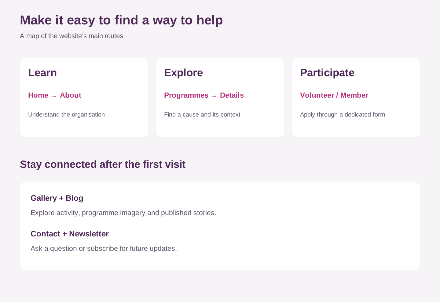
A person who wants to read about the organisation has a different task from someone applying to volunteer. I separated these paths through dedicated About, Programmes, Volunteer, membership and contact pages, while keeping shared navigation and footer links across the site.
The volunteer and membership application forms provide distinct destinations. Gallery, blog and newsletter content give visitors another way to stay connected when they are interested in the work but are not ready to apply or contribute.
Forms: make the next step feel acknowledged
Contact, membership, volunteer and newsletter forms connect the public-facing pages with Netlify Forms. Static form definitions allow Netlify’s build process to recognise submissions even though the visible interfaces are rendered by React.
The source also includes separate Netlify Functions for confirmation emails. For contact and application forms, the email step follows the form submission, so the acknowledgment email is distinct from the submission itself. This separates the essential action from a courtesy follow-up.
These are implementation details confirmed in the source. I have not submitted real applications or tested live email delivery as part of preparing this case study.
The donation interface: distinguish intent from completion
The homepage includes a donation interface with preset amounts, a custom amount field, contact fields and cause selection. This gives the intended contribution journey a clear visual structure.
In the reviewed implementation, the form changes to a thank-you state in the browser; I did not find a completed payment-processing step in that handler. This case study therefore describes the donation interface as designed, rather than claiming verified payment collection or funds raised through the website.
A complete contribution journey would need payment integration, reliable server-side recording and a confirmation tied to the actual payment result.
Development: a consistent system across content-rich pages
React and TypeScript organise the interface into page components and shared elements. React Router handles the different destinations, while reusable buttons, section labels, newsletter components and the main layout maintain consistency. Tailwind CSS supports responsive grids, spacing and interface states.
Vite provides the build setup, and Netlify hosts the website and its form and function integrations. Text, programme information and theme values are separated into structured data files, allowing content updates without rewriting the page components.
Responsive rules shift the navigation and multi-column sections for smaller screens. This describes the implemented approach; a rendered mobile usability review was not part of this case-study preparation.
The outcome and the next questions
The delivered website gives Ochaworth a connected presentation of its mission, programmes and ways to get involved. Visitors can move from the homepage to organisational context, programme details, community imagery and dedicated participation forms.
The evidence here is the delivered website, its published content and its implementation. I am not claiming a measured increase in donations, applications, traffic or engagement, or a formal user-research result.
The next useful evaluation would examine whether visitors can find a relevant programme, understand the difference between volunteering and membership, complete forms on mobile and receive clear feedback. Completing and verifying the payment journey would be another priority before describing online donations as a finished capability.
The project reinforced a practical design lesson: an organisation’s mission becomes easier to engage with when its content, visual hierarchy and participation paths tell the same story.